Greetings, my gentle students, and welcome back to the latest lecture in CraveOnline‘s infinitely prestigious Free Film School, the only non-accredited film school to make several notable NYU professors openly admit that their own film program is a bucket of scrod entrails in comparison. I am your humble professor, Witney Seibold, the author of the Free Film School and purveyor of film wisdom. Do you have your #2 pencil at the ready? Then we’ll begin.
This week’s lecture is going to be on a tangential but still-notable element of the film world, and one that I think warrants some study. We’re going to be looking briefly at the history, the impact, and the importance of film posters, lobby cards, and other advertising materials that could be considered a vital part of a film’s image. After all, we live in an age saturated with advertising, branding, and corporate sponsorship. Try going 24 hours without looking at an ad. If you stay indoors and read a book, maybe you can do that. Now try going 24 hours without looking at any corporate logos. Unless you live in a remote cabin on the shores of Walden pond, that’s become pretty much impossible. So, as critics and film enthusiasts, we have to admit to ourselves that the way a film is marketed, advertised, and emblazoned across billboards, has a direct influence on how we see a film. Of course most professional critics try to maintain something of a tabula rasa going into movies, and we have to be willing to give every film an even shake, no matter how or how much they are advertised. This, however, is an exceedingly difficult task, especially given the ubiquity of certain studio products – Even if you didn’t actually see Marvel’s The Avengers, you likely heard all about it without even trying.
It’s possible to judge a film without giving into the Madison Avenue hype machine, of course. But a highly-advertised film is often commented on differently in film reviews. Often, the advertising becomes an inextricable part of the film-going experience, and going to see a movie on opening day becomes less about the film itself, its place in cinema history, or even its aesthetic, and more about experiencing a cultural phenomenon, about being part of a national conversation that will last for the next few months; how often have you seen a film just because “everyone’s going to be talking about it,” or even just “because I’m curious about it,” and not because you are genuinely passionate? Moreover, how often have you been passionately excited about a movie, only to become slightly embarrassed about your excitement two years after the movie had come out? Most of the films we see are going to be super-hyped studio product, products of the moment, intended to have a strong impact in the short run, and little else.
But there is a separate art form connected to this advertising process that, independently of films and criticism, is a legitimate art form in itself. The creation of the movie posters. A long and glorious tradition that I’m going to start on by whinging about. And yes, I’m going to use the phrase “Have you noticed how awful film poster are these days?”
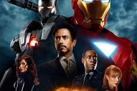
Have you noticed how awful film posters are these days? In general, they seem so drab and uninteresting, especially when compared to some of the elaborate and colorful painting and caricatures that we saw on movie posters of yore. You may notice that the bulk of movie ads feature either a huge close-up portrait of a well-known actor, or a similar portrait featuring a well-established licensed character. In many instances, the licensed character will be digitally enhanced in some way, and usually will not be displayed re-enacting a scene from the movie (I’m thinking of the really fake-looking digital rips in Spider-Man’s costume, or the even faker-looking dents in Iron Man’s armor in this regard). Live-action films will all be billed directly on the presence of their lead actor. Take a look at the poster for Skyfall, the last James Bond movie. Every single Skyfall poster featured the same image. Daniel Craig, laying on his back, firing a gun off camera, all against a plain white background, and a large black “007” logo. It was so simple, it could be recognized from miles away. Animated films are even more boring, as they tend to feature a single close-up of one (or all) of their animated cast, often against a plain one-color background, usually with some pithy tagline behind them in BOLD HELVETICA. I didn’t see the film, but thanks to its obnoxious poster, I wanted to do terrible things to the makers of Madagascar 3. The same thing is happening currently with The Croods.
I have learned that the reason current movie posters are designed the way they are (large portraits, primary colors, crisp digital enhancements) is that they have to be recognizable from a distance. From a marketing perspective, this is brilliant, as it will allow audiences to recognize the poster, even if they can’t see what’s on it. Also – and this was a surprise to me – it was revealed recently that many movie poster designers have to keep online shopping sources in mind. If you’ve ever shopped for a video online, you’ll usually find that the movie is accompanied by a small “thumbnail” image to distinguish it from all its surrounding peers. The thumbnail image is usually only about one inch by two inches at most. A movie poster, it turns out, has to be recognizable when it’s only two inches high. If you fill your poster with Halle Berry’s face, well, that will still read when it’s tiny. Aesthetically, it’s dull as stale day-old toast. Functionally, it works perfectly.
A brief history of the poster as an advertising tool. Back in the 1930s, when large sheets of paper displayed in front of movie theater first because a ubiquitous advertising tool, most posters were provided to theaters by independent contractors. The independent contractor would be given a description of the film, maybe some photos of the actors, and the contractor would be the one to design and print the ad. The contractor would also own the posters, no matter who owned the movie, and the poster would typically have to be returned to the contractor when the theater was done with it. It wouldn’t be until later that the studios who made the films would also be responsible for designing the posters and advertising their own movies. Nowadays, studios have their own graphic design departments, and their own advertising departments, and they typically print and distribute their own posters, giving them to movie theaters often for free. The movie theaters use them at their discretion, and often throw them away at the end of a theatrical run.
I have worked in movie theaters most of my life, so I can personally attest to the shoddy treatment most posters receive. The studios can, of course, be contacted about receiving certain posters, but, for the most part, studios will send out posters willy-nilly to any theater they can, whether or not that theater is showing the film the studio wants advertised. Theaters throw away a lot of posters. If you collect posters, make friends with the theater people. They might save some for you.
Oh yeah, speaking of collecting, most people know that movie posters are typically a pretty hot collectible for anyone interested in movie memorabilia. This wasn’t so in the early days; since press materials would have to be shipped back, the only people who owned them were, well, thieves. The only people who would put film posters up on their walls were rich studio execs who could afford an exotic item like a movie poster, and who wanted to decorate their offices with their previous successes. When the studios took over poster printing in the late 1940s, movie posters became more accessible to consumers, and pretty soon movie fans could actually accumulate their favorite advertising materials. Also hot were what they call lobby cards, which were smaller posters (usually about the size of a piece of standard writing paper) and often featured production photos of movie scenes. These lobby cards fell out of favor in the 1960s in favor of the larger poster size that is still being used today. For college kids planning on framing a movie poster: American movie posters usually run about 27” by 40” or 41”. Plan accordingly.
We are familiar with a lot of language that is associated with the film advertising machine. I used the word “tagline” above, and I think we all know what it means. A tagline is a short advertising slogan that accompanies the film’s title. “Just when you thought it was safe to go back in the water” from Jaws 2 is probably the most famous tagline of them all. Although it can be confusing. I talked to several people who thought the title of the latest Bruce Willis film was Yippie-Ki-Yay Mother Russia, and the tagline was “A good day to die hard.” Also, thanks to posters we’re familiar with the notion of a “teaser.” A teaser poster is a low-fi version of a poster, usually with little information on it, that will be released well in advance of a film, and certainly in advance of the intended advertising poster. If you’ve seen the poster for the upcoming Man of Steel, you’ve seen a teaser. There’s nothing on it other than the Superman logo on a guy’s chest. That’s it. It teases you with little information.
You may have noticed that most all movie posters (that aren’t teasers) have a list of credits somewhere on them. These are not the full list of credits, but typically the people who are considered the department heads and stars of the movie. You’ll have the director, the producer, maybe some of the stars, the musician, the editor, the screenwriters. This small list of credits is usually called the billing block, although few outside the industry use the term. The billing block is usually part of a contract, and the studio is legally obligated to give those people credit.
As I said, most posters these days are arranged by in-house graphic designers who work at the studio, or by contracted advertising agencies. It’s rare that a poster will be specially commissioned by a known artist anymore, but it was once frequent that notable painters and artists would be hired specifically to work on movie posters. One only needs look at some old movie posters to see this. There was a time when elaborate and busy and often very gorgeous paintings would be used to advertise movies. The most famous graphic designer to work on movie posters was probably Saul Bass, who designed the posters for Vertigo, North By Northwest, Anatomy of a Murder, and The Man with the Golden Arm. Bass would often also design the credits sequences for those same films. Saul Bass was known for his stark aesthetic, and use of simple shapes. He was a minimalist of the highest order, and his posters are immediately recognizable. Bass would eventually direct a feature film of his own, a bizarre psychedelic killer ant movie called Phase IV.
If you’re a fan of old sci-fi movies (as I am) then you should probably know the name of Reynold Brown, who conceived of the famous posters for Creature from the Black Lagoon, This Island Earth, Attack of the 50 ft. Woman, and the boldly huge Ben-Hur. If Saul Bass was a minimalist, then Reynold Brown was a maximalist, squeezing every last bit of detailed excitement out of his images. I would argue that the best of the movie poster painters had the capability of making whatever film they were designing look like a gigantic adventure epic, even if it wasn’t. Attack of the 50 ft. Woman is a corny, largely low-budget sexploitation movie from the 1950s, but the poster promised that it would be enormous. I can’t speak too much to the film, but that poster is a work of art.
And if it’s epic you like, then you should probably also know the name of Drew Struzan. Struzan is a painter who works with airbrushes to create some of the most boldly evocative movie poster in cinema history, including the posters for Star Wars, the Rambo movies, the later Indiana Jones movies (Raiders of the Lost Ark was painted by a fellow named Richard Amsel), The Goonies, and the Back to the Future movies. Anyone who was brought up in the 1980s is intimately familiar with Struzan’s work, whether or not they even know it. He managed to make his poster shimmer with energy using a near-impressionistic style. His portraits make the characters more handsome, more amazing, more epic. As I said above, often the poster for a movie can inform the way we see a movie. The way Drew Struzan did it, this was no bad thing.
And, yes, there are dozens more poster painters of note. I encourage you to look up who designed or painted your favorite movie poster, and learn more about their career. Also, look up some information on the Key Art Awards, which is an annual poster design award.
Whither poster design today? It seems to be in a fallow period, what with the thumbnail mentality behind most of it. But there are still many creative and striking graphic designers that are influencing films to this very day. Indeed, look at what The Criterion Collection is doing. They may not be designing posters, but the covers to their DVDs and Blu-rays are often astonishing.
Homework for the Week:
The next time you look at a movie poster, try to look past the film being advertised, and look at the poster in itself (in the Platonic sense). What kind of aesthetic does it achieve? What is it saying? Is it a thing of beauty in itself, or its it just an advertising tool? And, most importantly, how does it make you feel about the movie? What is the advertising doing? What posters would you like to have on your walls? What is your favorite painted poster? Who painted it?
Witney Seibold is a featured contributor on the CraveOnline Film Channel, co-host of The B-Movies Podcast and co-star of The Trailer Hitch. You can read his weekly articles B-Movies Extended, Free Film School and The Series Project, and follow him on “Twitter” at @WitneySeibold, where he is slowly losing his mind.