Photo: Timothy T Ludwig (Getty Images)
The NFL season is right around the corner. We’re not kidding. While it seems like this summer will never end and football is far away, the first preseason game is Aug. 4. That’s when the Jacksonville Jaguars take on the Las Vegas Raiders at the Hall of Fame Game. That’s why you’re likely seeing websites and magazines beginning to dissect team depth charts, position competitions, fantasy rankings, and everything else associated with each of the 32 NFL teams.
Since all of the other sites and magazines already seem to have most of the basics covered, we figured we’d tackle (get it?) one of the more pressing matters. We’re going to definitively rank the top 10 NFL team logos based on how badass or wimpy they are. Wouldn’t you want to go into the season knowing that your team has a leg up because they don’t have a lame logo? We know we would.
Before we start, you need to know a little bit about how we came to these conclusions. We sifted through the various logos, and we immediately removed logos that were simply the name of the city with little to nothing else exciting involved. That’s why San Francisco, Kansas City, the LA Rams, Washington, Chicago, the New York Giants, Green Bay, and Cincinnati were immediately removed from competition for being embarrassingly boring.
Next, we weeded out logos that are barely logos at all. We’re talking about the Browns literally having a logo of their orange helmet. Then we kicked out the logos that either make no sense or are unintimidating. This means we said goodbye to Miami, Arizona, Los Angeles Chargers, New Orleans, Pittsburgh, Indianapolis, Baltimore, New England, and others. We were left with only a few worthy ranking at all. We picked the 10 that actually had the tiniest amount of aggressiveness. Keep scrolling to see them all.
Badass NFL Logos
-
10. Tampa Bay Buccaneers
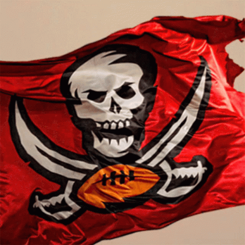
This logo is simply a pirate flag and there is no logo even remotely as scary. It’s like a giant old-timey boat sailed past you and you realized it had a skull and cross bones flag and you realized you were done for.
-
9. Jacksonville Jaguars
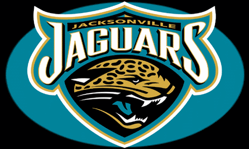
Just like the Carolina Panthers logo, the Jaguar on Jacksonville’s logo looks really mad. It looks like it might do anything to win. Either way, we don’t like it.
-
8. Las Vegas Raiders
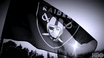
The name says it all. This is a team of raiders and pillagers. We assume they’re some type of pirates. The pirate on the logo only has one eye. Terrifying.
-
7. Carolina Panthers
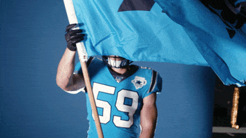
The black cat in this logo looks really mad. We wouldn’t want to tangle with this panther. It’s the stuff of nightmares.
-
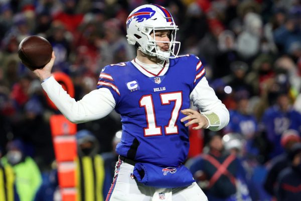
6. Buffalo Bills
While this logo makes absolutely no sense since this team is named for a famous cowboy, there’s no disputing the badass nature of a charging buffalo.
-
5. Detroit Lions
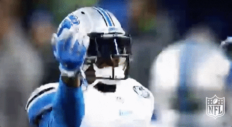
This logo is fairly simple and boring, but it’s a lion. What’s scarier than having a lion run straight at you in the middle of a football field?
-
4. Tennessee Titans
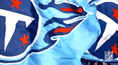
You might be confused by this addition as the logo is mostly just a “T” for the city’s name. But the aggressively burning fire attached to the letter is what makes this one noteworthy.
-
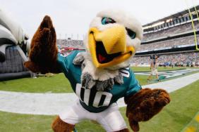
3. Philadelphia Eagles
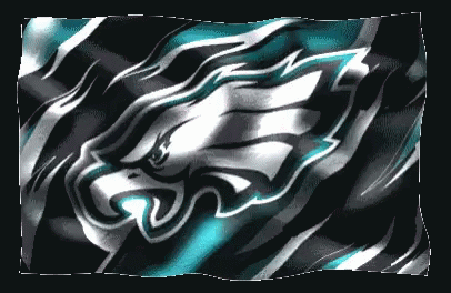
The Philadelphia Eagles wasn’t always a scary, made-up looking eagle. It used to be some boring wings. We’re pretty glad they ramped up the fear with the new logo.
-
2. Minnesota Vikings
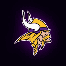
Vikings have been known to pillage and burn down villages, among other terrible activities. The logo is a Viking and it’s absolutely intimidating.
-
1. Denver Broncos
While horses aren’t the most intimidating animals ever, a bucking bronco is pretty badass. We wouldn’t want to have to battle a wild horse.